|
<< Click to Display Table of Contents >> Design guidelines |
  
|
|
<< Click to Display Table of Contents >> Design guidelines |
  
|
To ensure that your templates look their best both on a PC and on a TV, you should adhere to the following guidelines for designing templates:
1.A template should always consist of at least one repeating page. Title and end pages are optional.
You can also refer to the notes on template design.
2.At least one page of your template should include a project placeholder. Project placeholders will later be replaced, via the export through real projects and chapters.
3.Ensure that the pages of your document contain buttons that allow navigation. Make sure that a “back” button jumps back to earlier levels when the back “action” is impossible. In this way you can create templates that manage without the “up one level” buttons.
4.Design your template so that it is easily navigable on both a 4:3 and a 16:9 TV screen. You should therefore decide how the aspect ratios of the templates should be customized if they turn out to have a different aspect ratio to the export.
•If you retain the aspect ratio of a page, the page will later appear in its entirety and in the aspect ratio in which you have designed it. However, this may lead to you seeing black borders at the top and bottom of the page (or to the left and right). •If you want to crop the page, the Menu Wizard will crop the page when it is exported to the preferred export aspect ratio. This means that you will avoid black bars, but may mean that you are no longer able to see the top and bottom sections of your template (or, indeed the far left or right). |
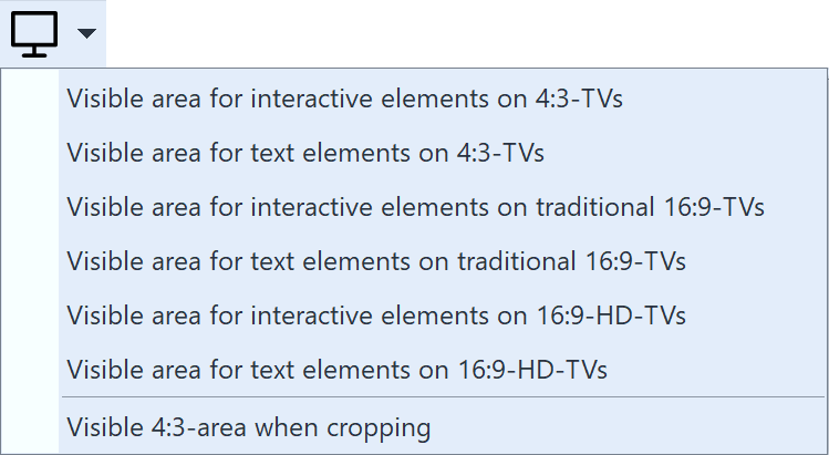
5.TVs, and especially more old-fashioned models, have an area at the edges of their screen where the correct display cannot be guaranteed.
You can adjust these areas by using the ![]() menus to fade them in or out.
menus to fade them in or out.

Visible areas
6.It is also possible to fade in the part of the template that would be cropped in the 4:3 format.
7.It is best to avoid putting interactive elements such as buttons or project placeholders too close together, or even overlapping, because this can lead to navigational difficulties with DVD players. Please also note that the Menu Wizard for DVD menus will put a frame around selected buttons and project images. The area covered by the frame is crucial for the DVD player and to the buttons and should not intersect with another area.
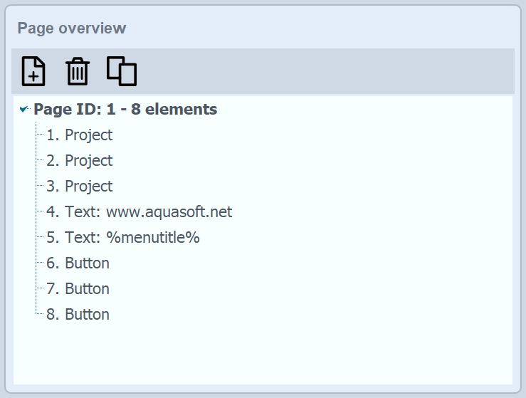
8.Make sure that buttons and project placeholders are located above all other non-interactive elements and are not covered by any other elements. This allows you to avoid problems when navigating in PC menus. You can place one element over another by dragging it with the mouse into the page structure view underneath the previous element on that page.

Page overview